Role
BX Designer
Application
On/Offline Channels
Duration
1month

Overview
As the existing marketing strategy is focused on developing the strategy only with content, it is difficult to communicate with customers and reach a consensus through the unique brand image of Hyatt Regency Vancouver. As a solution to this, I newly define Hyatt Regency Vancouver’s core value and unique brand key-visuals and propose the latest BX design principles and guides from a digital marketing perspective.
Brand Analysis
I extract core values based on three re-branding adjectives 2024 by Hyatt Regency Vancouver. This has defined the brand marketing slogan.
Three Re-Branding Keyword 2024
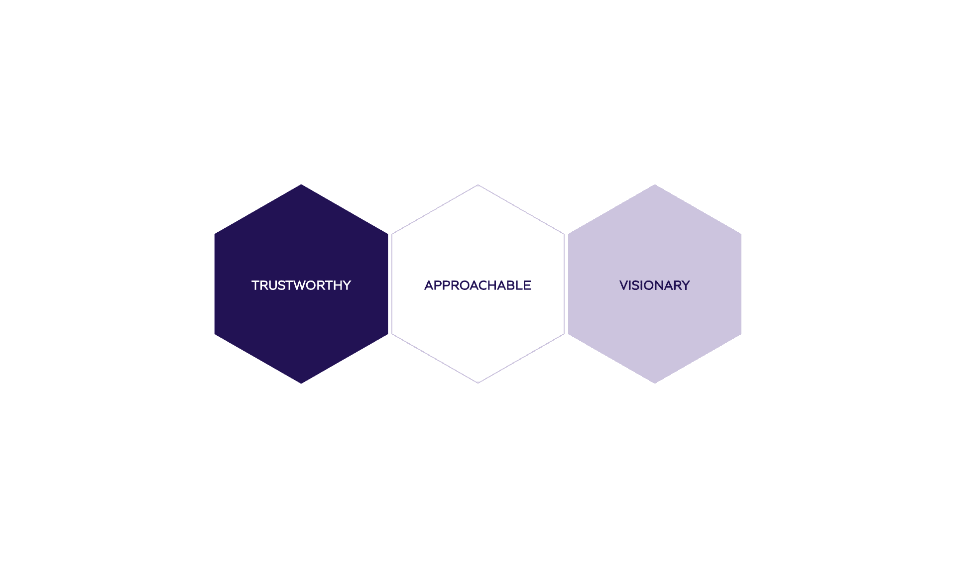

Core Value
Through the three re-branding adjectives, I came up with a reliable “lighthouse-like being” that always tells us the way to move around, and set it as our core value. This core value is the foundation of Hyatt Regency Vancouver’s unique brand image.
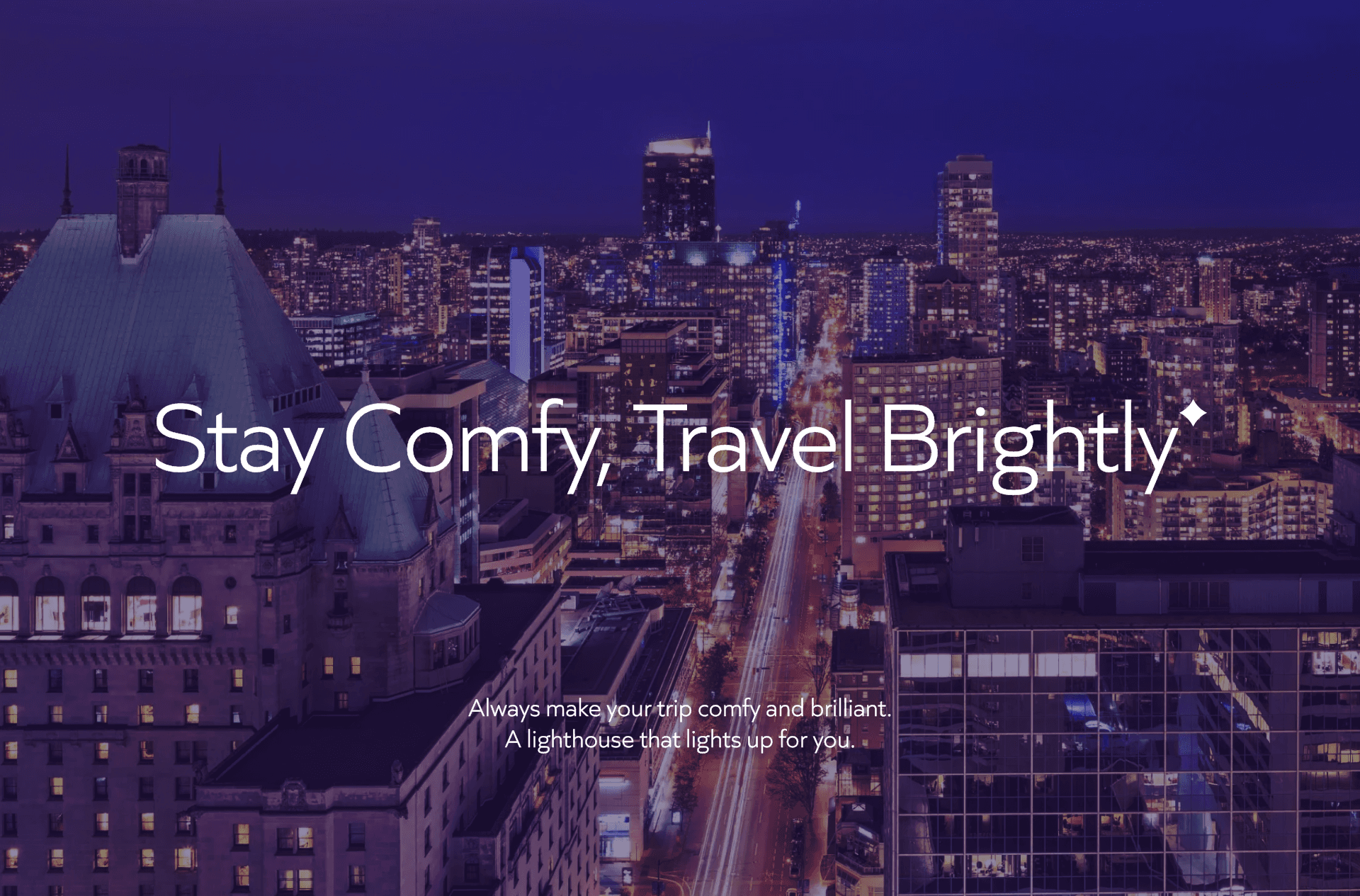
Brand Slogan
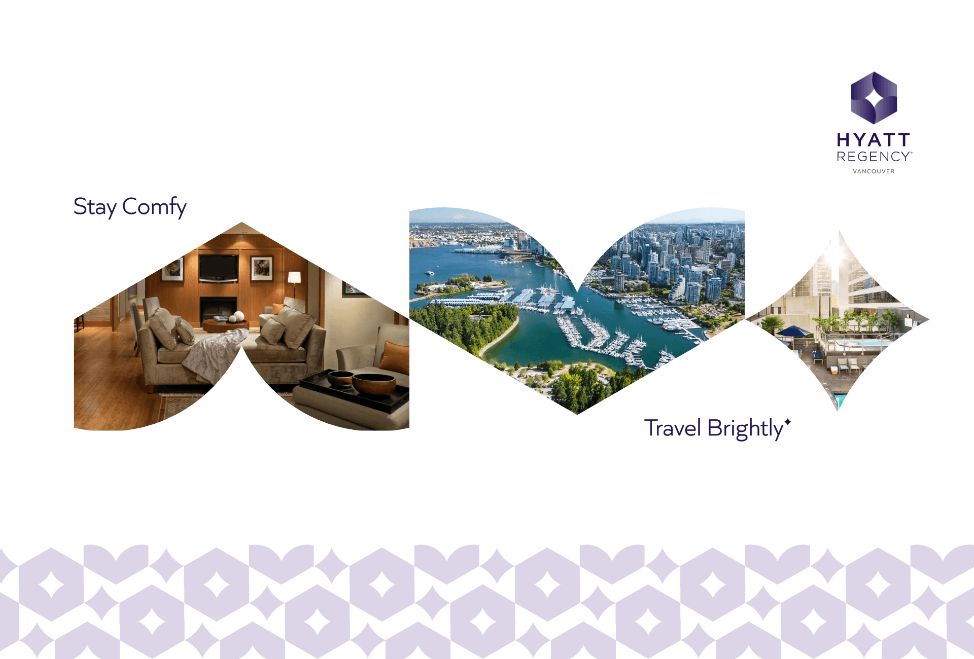
Based on the brand’s core value of “A lighthouse-like being” set earlier, I have developed a brand slogan called “Stay Comfy, Travel Brightly” to mean staying comfortable and having a brilliant trip through Hyatt Regency Vancouver.
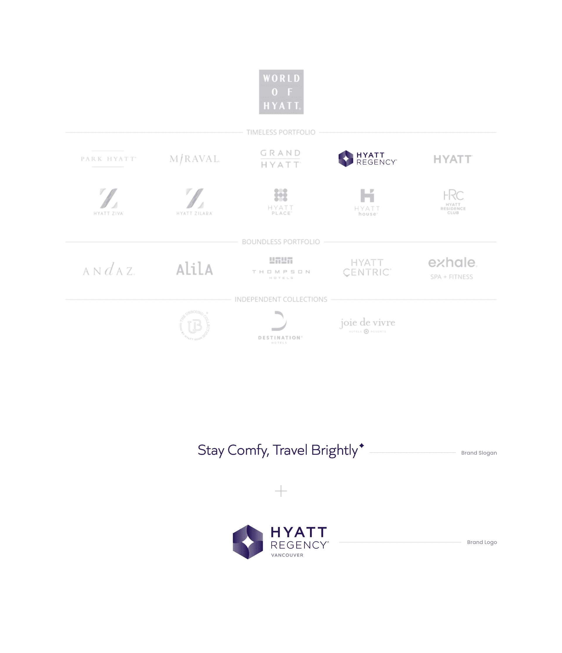
Brand Architecture
Most of the brands in the Hyatt hotel chain emphasize independent brand design. Therefore, this brand marketing strategy uses the Hyatt Regency Vancouver’s brand slogan along with the basic logo to recognize both at the same time.
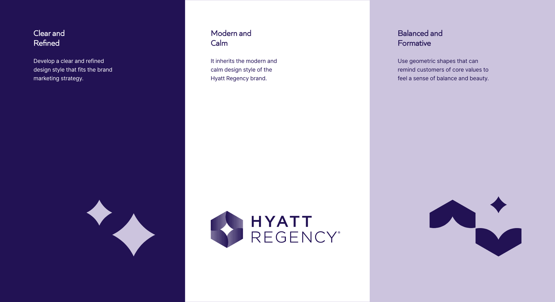
Brand Design Principle
Hyatt Regency Vancouver’s brand design expression principle is derived from its core value, ‘A lighthouse-like being’. It delivers a consistent brand identity through clear and refined design, modern and calm design, balanced and formative design.
Exclusive Key Visuals
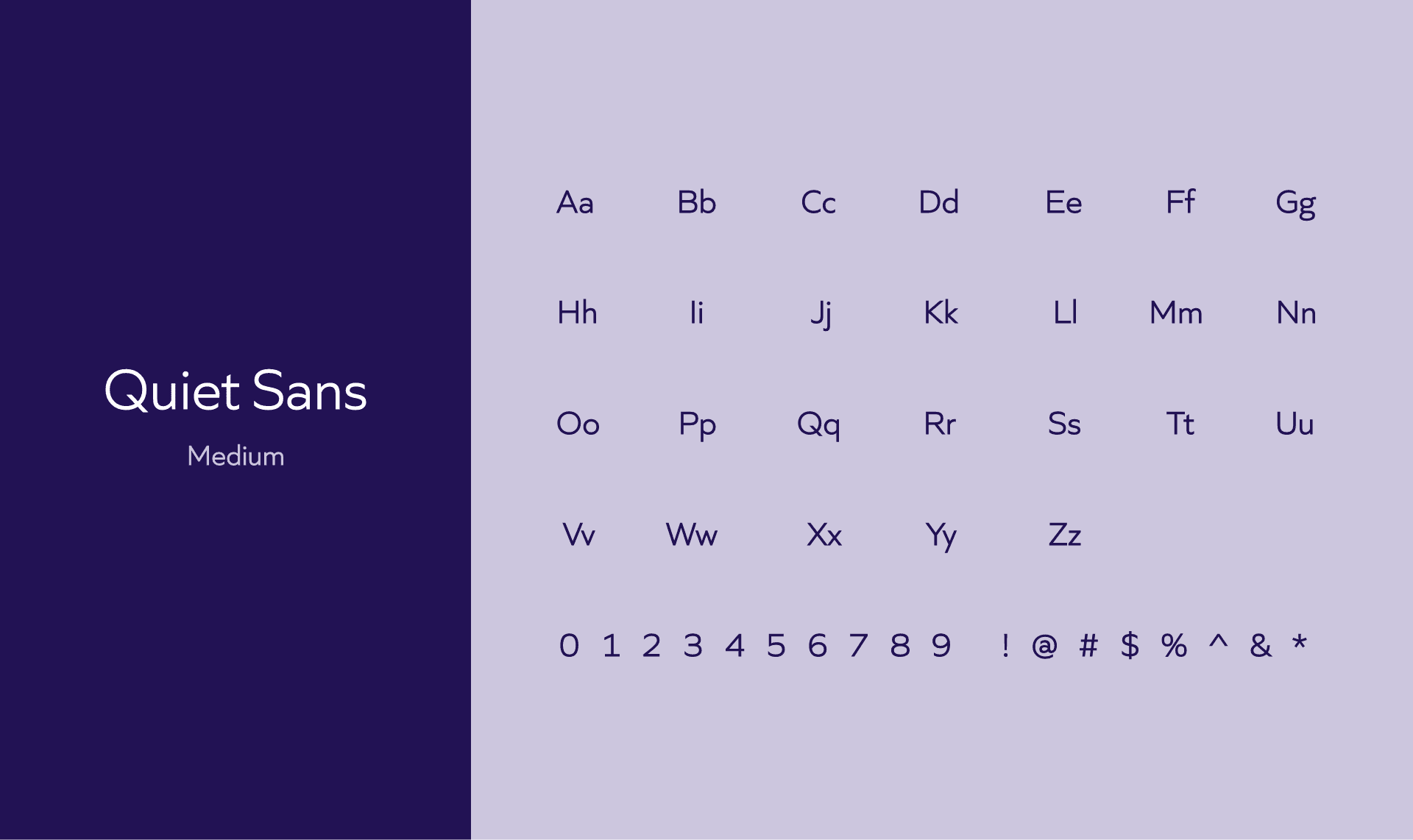
Typefaces: This project utilizes the Quiet Sans font used in the Hyatt Regency brand logo as a font dedicated to the Hyatt Regency Vancouver brand design. Only medium font thickness in the Quiet Sans font family can be used to optimize for multiple marketing channels and deliver a consistent brand experience to customers.
Colors: This project inherited Hyatt Regency’s brand color and used it for overall online and offline marketing.
Geometric Shapes: This project utilizes the basic formations of the Hyatt Regency brand logo symbol as geometric figures symbolizing the brand slogan. Geometric figures can be used for multiple marketing channels along with videos, images, and text, and can be extended to various interaction elements in the UI environment as well as print and outdoor advertising.
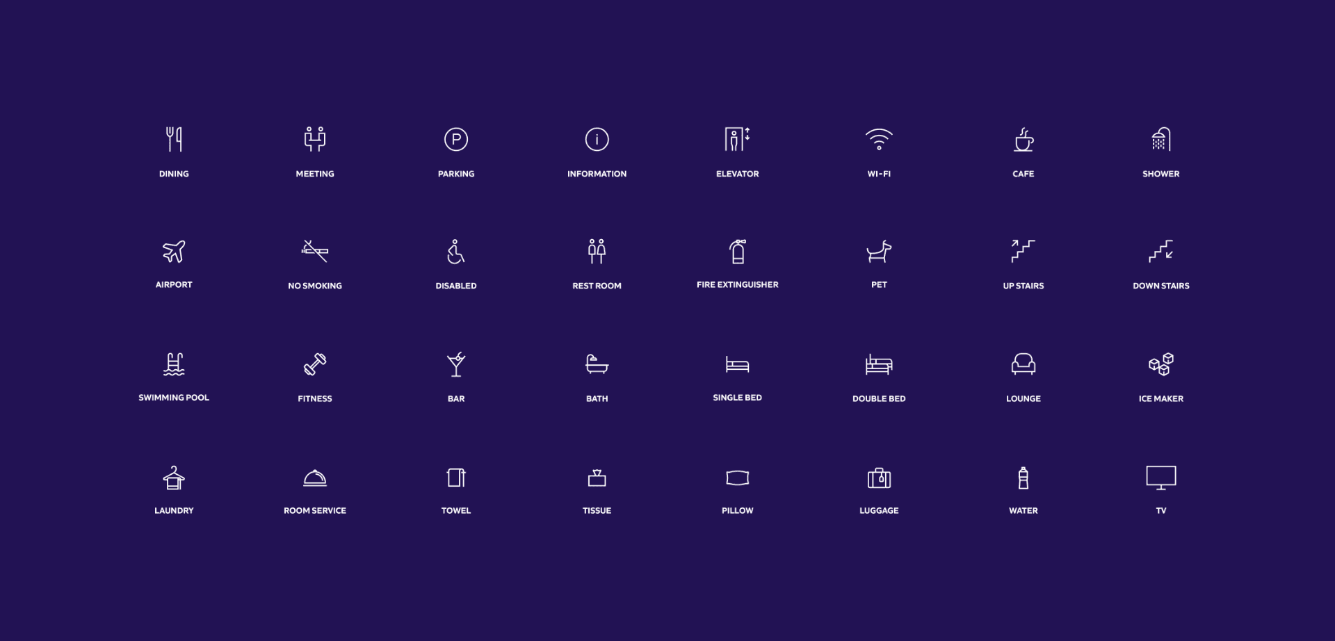
Icons: The purpose of this project is to strengthen communication with customers through Hyatt Regency Vancouver’s unique brand image. Therefore, icons that can be used frequently when conducting online and offline marketing are organized according to the concept to provide a consistent brand experience that begins with core values and brand slogans.

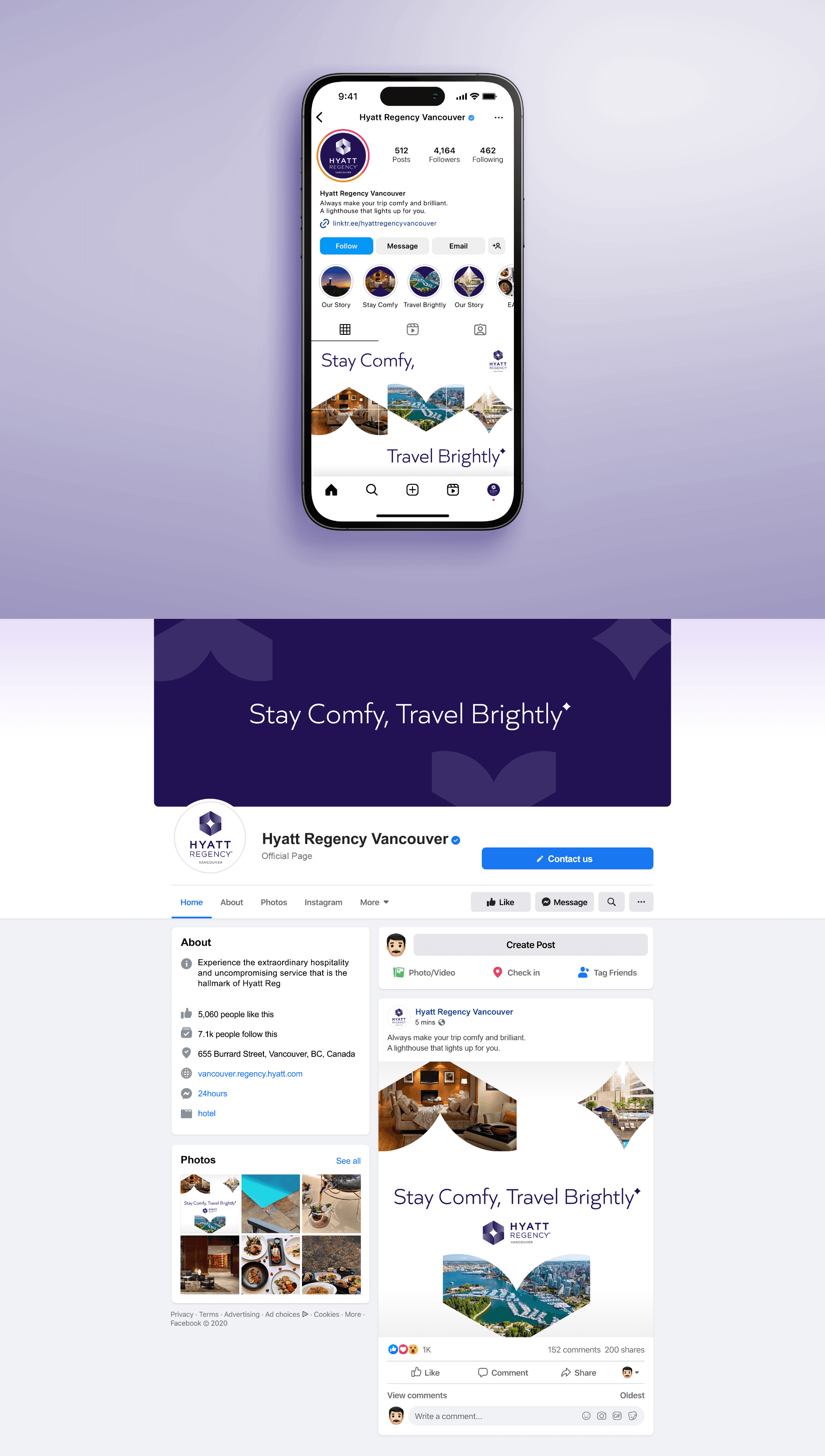
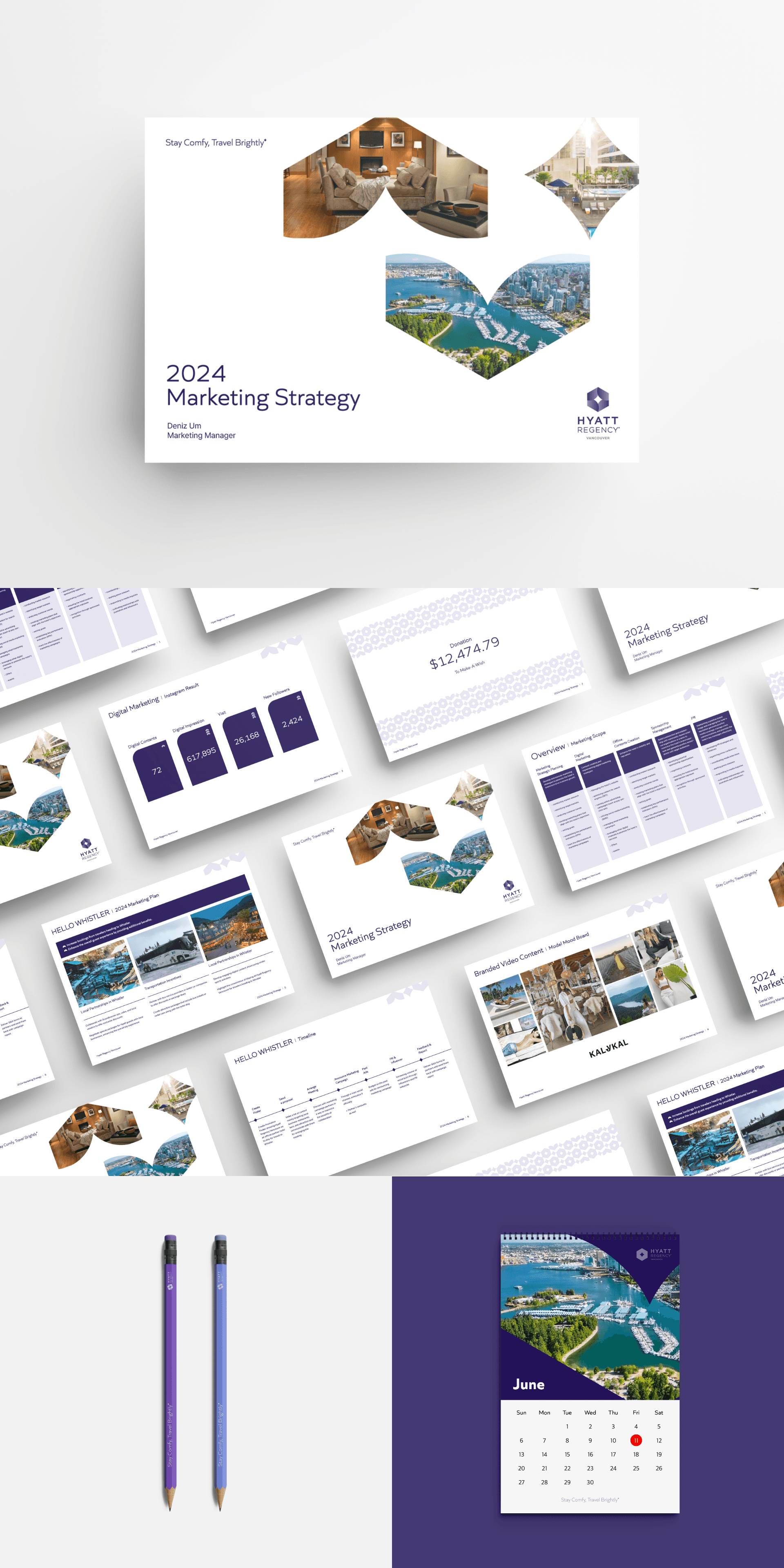
On-offline Marketing Applications
This project proposes applications that visualize Hyatt Regency Vancouver’s unique online and offline marketing strategy on multiple marketing channels, utilizing the core values, brand slogans, brand design principles, and dedicated key visual elements outlined above.