Role
Product
Duration
MAU

Overview
MONKi (Monthly Kitchen) is a digital restaurant-curated shop and O2O food ordering service where customers can browse and order from 200 trendy restaurants. We planned and designed a new kiosk experience that maximizes usability, accessibility, and aesthetic appeal, reflecting business needs, on-site user feedback (UT) regarding long queues during lunch, and the latest UI/UX design trends.
Collaboration
PM Team: Business Logic, UT, Team Review, Wireframes.
Design Part: UT, Wireframes, UI/UX Strategy Planning, UX Flow, UI Design, Interaction, Design System.
Engineer Team: Development by Flutter.
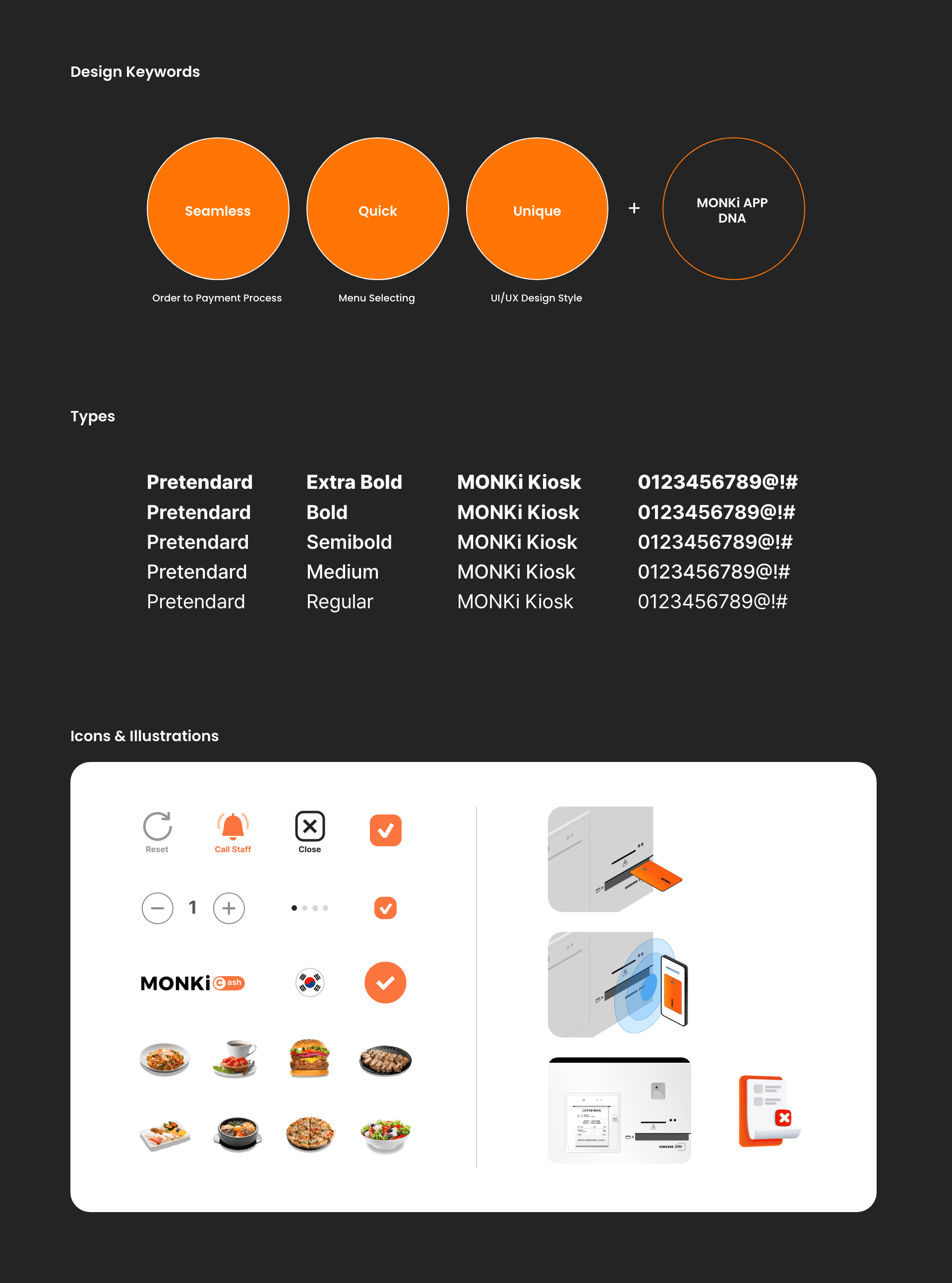
Design Foundation
Design Keywords: Seamless, Quick, Unique, MONKi APP Design DNA
Typefaces: Pretendard Extra Bold, Bold, Semibold, Medium, Regular
Icons & Illustrations: Applying MONKi App’s Icon & Illustration style to new Kiosk UI.
Background
MONKi branches frequently experienced long queues at their kiosks during lunch hours due to high customer traffic, leading to a degraded customer experience. From a UX perspective, we set the goal to "minimize customer hesitation during kiosk ordering." This highlighted the need for a new kiosk experience design. The planning comprehensively incorporated business needs for improving the existing kiosk user experience, feedback from on-site User Tests (UT), and the latest UI/UX design trends.

Problem
The primary issue identified was the complex user flow of the existing kiosk, which required navigating through 5-6 screens to reach the payment process. Furthermore, information during store selection and menu browsing was not intuitively presented, causing customers to spend significant time choosing menus and placing orders. This was a major problem, leading to long kiosk queues during peak times like lunch and generally hindering ordering efficiency.
Solution
To minimize customer hesitation and encourage quick ordering, we implemented the following UX/UI design approaches:
Solution 01
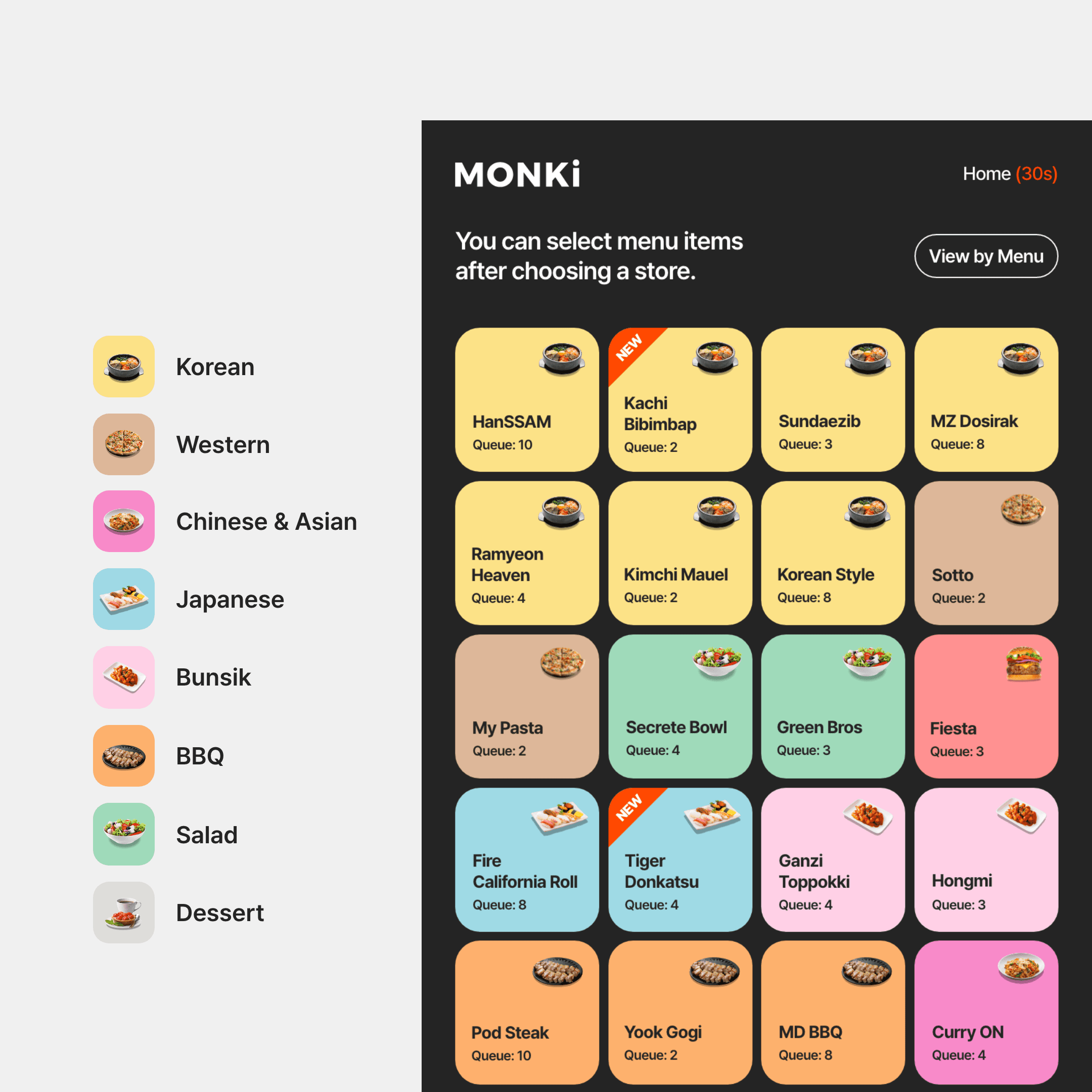
Store/Menu Selection
Color/Icon Categorizing
In the store selection screen, we adopted a 4x6 array to display all stores at a glance, addressing the drawback of having to infer categories from store names.
We used menu category icons and designated color-coded UI to enable intuitive distinction between 14-22 stores.
Solution 02
Micro Interaction
Applied micro-interactions to emphasize key areas, Call-to-Action (CTA) buttons, and at process completion points. This guides user actions intuitively and provides clear recognition of progress, naturally prompting users to the next step.

Solution 03
Seamless Transition
Improved the existing User Flow that previously required navigating through 5-6 screens to reach the payment process.
Applied a vertical scrolling screen transition to make the User Flow from the main screen to the shopping cart appear as '1 Depth,' thereby reducing the number of steps.

My Approach & Impact
From a business perspective, discussions with the business team to define the project scope led to a consensus: we needed to consider not only kiosks for existing branches but also for future roadshop expansion. Based on this, I designed the kiosk UI. For user testing, I visited branches with my team members to observe and analyze customer flow, and their behavior during ordering, dining, and after meals. Applying these insights to the actual product design was incredibly engaging. The biggest challenges during kiosk ordering were the difficulty in distinguishing menu categories by store and the significant time spent transitioning between screens. We resolved these issues through a facilitating meeting that included the CEO, business team, sales team, PMs, and the engineering team. This meeting led to key decisions such as categorizing menus by color and icons, and implementing interactive UI. This collaborative approach, integrating diverse perspectives from various departments, was instrumental in making key UX design decisions. As a result of these efforts, the MAU for the MONKi Kiosk increased from 800 to 2,500.